|
Pink is a dangerous colour, I've recently learned. Fanny Ambjörnsson has written a book on the subject, "Rosa - den farliga färgen" (Swedish only). Very interesting thoughts, which made me reflecting on my own relation to the colour in question. I love pink! Not all of the nuances though. The dirty grayish nuances are not for me. They have been hugely popular the last couple of years, but no, they are too pale and dull. Also the pinks going towards orange, such as coral pink or salmon pink are not really my cup of tea. Pastel pink however, can be very pretty. For me it’s a colour representing the summer in the country side. Pretty dresses, daisies in the lawn, wallpapers, curtains and the easy, bright, light life where the sun always shines. You don’t see me wearing it that much, but I have plenty in my house. Cerise is my absolute favourite pink. Combine it with red, orange and black and we have a winner! I dress in this colour combo as often as I can. It’s a colour for the tough but kind hearted woman, vibrant of energy and demanding attention. I made an arrangement of some pink objects I found in my studio. Very representative of the things I like and get inspired by. Enjoy! 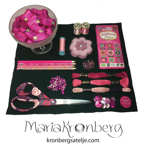 Pink details in my studio.
0 Comments
Leave a Reply. |
AuthorSurface pattern designer who loves folk art, gardening and the good things in life. Archives
February 2018
Categories
All
|
 RSS Feed