|
Pink is a dangerous colour, I've recently learned. Fanny Ambjörnsson has written a book on the subject, "Rosa - den farliga färgen" (Swedish only). Very interesting thoughts, which made me reflecting on my own relation to the colour in question. I love pink! Not all of the nuances though. The dirty grayish nuances are not for me. They have been hugely popular the last couple of years, but no, they are too pale and dull. Also the pinks going towards orange, such as coral pink or salmon pink are not really my cup of tea. Pastel pink however, can be very pretty. For me it’s a colour representing the summer in the country side. Pretty dresses, daisies in the lawn, wallpapers, curtains and the easy, bright, light life where the sun always shines. You don’t see me wearing it that much, but I have plenty in my house. Cerise is my absolute favourite pink. Combine it with red, orange and black and we have a winner! I dress in this colour combo as often as I can. It’s a colour for the tough but kind hearted woman, vibrant of energy and demanding attention. I made an arrangement of some pink objects I found in my studio. Very representative of the things I like and get inspired by. Enjoy! 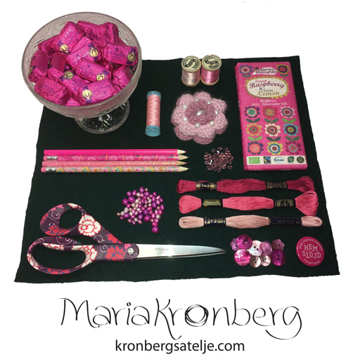 Pink details in my studio.
0 Comments
I'm currently taking a class on colour theory, at undergraduate level. It is so much fun! One of the exercises is to make a colour collection of about 15 different colours and make a moodboard around that. I’m terrible at visual moodboards, I prefer to tell my stories in words. 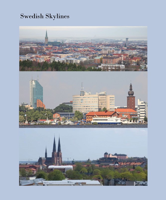 Photos I found online of some Swedish medieval towns. These inspired my colour collection. These are the skylines of three medium sized towns of medieval origin in central Sweden. I’ve used to live in them, and they are all very “lagom” and similar to each other. I was drawn to these particular pictures I found online because they all show cloudy skies, lots of greenery and typical red-brownish brick buildings. The skies are very much the typical everyday Swedish skies; hazy, light purple blue and no direct sun light. Gray and dull. Have you ever sat close to the window at a Swedish café looking out the window? Did you perhaps notice that all of us are washed-out colourless clones? This is Scandi Style for real, and has very little to do with what you see under the hashtag at Instagram and Pinterest. Swedish people do not like colours. The Swedish people feel comfortable in colours with very much blackness and very little chromaticness. And we want it monochromatic. Because we all want to be “lagom” and fit in. Less is more. Therefor I decided to make a colour collection fit for a Scandinavian fashion brand (targeting primarily women), one where simplicity, straight lines, natural materials and sustainability are the catch words. Neutral colours that can be mixed and matched, and used season after season, year after year. 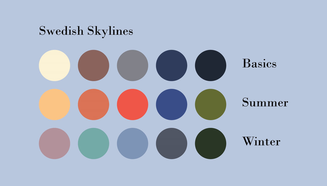 My set of colours for a fictional fashion brand targeting the urban woman. All the colours in my palette are from the photos. I rasterize the picture first, to get a better view of the colours it’s made up of, and then choose intuitively. In the back of my head I’m thinking “bright” for summer and “cool” for winter. I want the colours to be representative and symbolise the essentials of the Swedish medieval town; the bricks that build up the cathedral, castle, town hall, and trade centers, the copper and tile roofs, the pine forests and parks, the sky… Not to many colours, I really want to keep it simple.
You will most probably not find me wearing these colours (although come to think of it I have a dress in the blue and orange nuances and hues). However, I can picture them on the coolish, professional people working in the city; the lawyer, the banker, the business person, the receptionist, and so on, all with perfect French manicured nails and flawless make up. Very sleek and stylish. I am the worst doodler, ever. I hate pencils and pens. They are extremely uncomfortable, not to mention untrustable. They never behave like I intend. This has been a problem for my entire life, and I was the first kid at school who was allowed to use a word processor for my essays (we’re talking very early 1990’s). The teacher could never read what I wrote, nor could I. Dyslexia some of you may think, but no, most certainly not. Dysgraphia then? No, I don’t think so. I just have very bad fine motoric skills. But you do embroidery, and lace making, and pearls and all those tiny things! That is true, but it is also very time consuming. What normal people finish of in half an hour would take me a full day. Over the years I’ve learned a few tricks to get over it;
As a special treat I decided to show you my worst doodles, and what became of them. Enjoy!
|
AuthorSurface pattern designer who loves folk art, gardening and the good things in life. Archives
February 2018
Categories
All
|
 RSS Feed