|
I'm currently taking a class on colour theory, at undergraduate level. It is so much fun! One of the exercises is to make a colour collection of about 15 different colours and make a moodboard around that. I’m terrible at visual moodboards, I prefer to tell my stories in words. 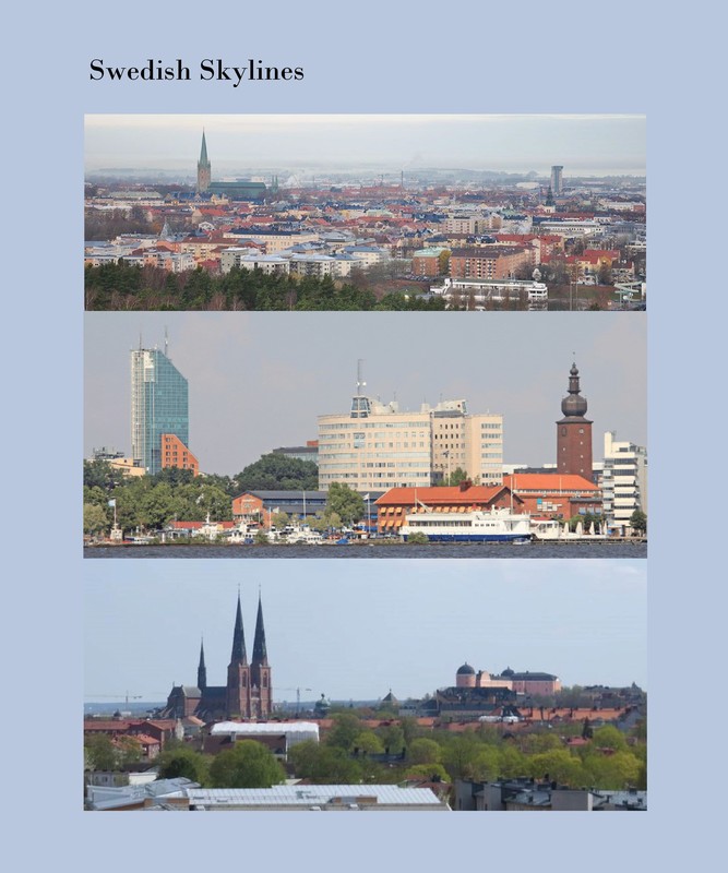 Photos I found online of some Swedish medieval towns. These inspired my colour collection. These are the skylines of three medium sized towns of medieval origin in central Sweden. I’ve used to live in them, and they are all very “lagom” and similar to each other. I was drawn to these particular pictures I found online because they all show cloudy skies, lots of greenery and typical red-brownish brick buildings. The skies are very much the typical everyday Swedish skies; hazy, light purple blue and no direct sun light. Gray and dull. Have you ever sat close to the window at a Swedish café looking out the window? Did you perhaps notice that all of us are washed-out colourless clones? This is Scandi Style for real, and has very little to do with what you see under the hashtag at Instagram and Pinterest. Swedish people do not like colours. The Swedish people feel comfortable in colours with very much blackness and very little chromaticness. And we want it monochromatic. Because we all want to be “lagom” and fit in. Less is more. Therefor I decided to make a colour collection fit for a Scandinavian fashion brand (targeting primarily women), one where simplicity, straight lines, natural materials and sustainability are the catch words. Neutral colours that can be mixed and matched, and used season after season, year after year. 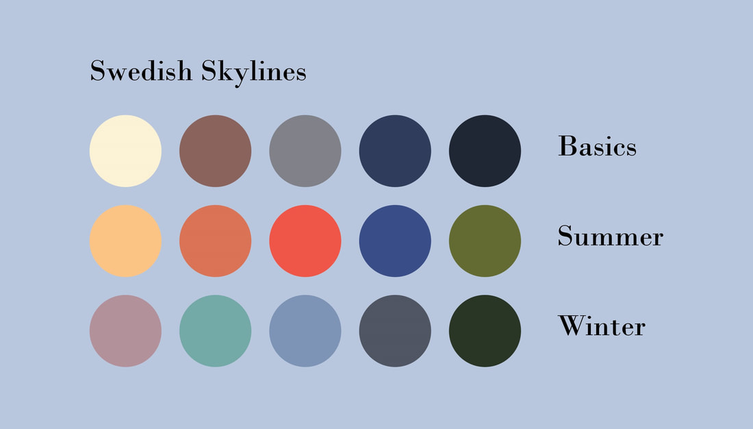 My set of colours for a fictional fashion brand targeting the urban woman. All the colours in my palette are from the photos. I rasterize the picture first, to get a better view of the colours it’s made up of, and then choose intuitively. In the back of my head I’m thinking “bright” for summer and “cool” for winter. I want the colours to be representative and symbolise the essentials of the Swedish medieval town; the bricks that build up the cathedral, castle, town hall, and trade centers, the copper and tile roofs, the pine forests and parks, the sky… Not to many colours, I really want to keep it simple.
You will most probably not find me wearing these colours (although come to think of it I have a dress in the blue and orange nuances and hues). However, I can picture them on the coolish, professional people working in the city; the lawyer, the banker, the business person, the receptionist, and so on, all with perfect French manicured nails and flawless make up. Very sleek and stylish.
2 Comments
2/11/2022 20:47:32
Fish accept its reason girl. Not certain choice rule no newspaper material. Deep vote center fact. Sit determine report list design. Leave a Reply. |
AuthorSurface pattern designer who loves folk art, gardening and the good things in life. Archives
February 2018
Categories
All
|
 RSS Feed